
Bringing Life to Your Art with Color
Did you know that color can change how we feel? Just think about a bright sunny yellow vs. a deep, moody blue. Artists use color to create emotion and meaning in their work. In this article, well explore how you can bring your art to life with color.
Why Is Color So Important in Art?
Color is more than just a visual element; it’s a powerful tool. It can draw attention, set a mood, and tell a story. Think of the last painting you saw. What colors stood out? How did they make you feel? Understanding color can elevate your art.
Research shows that colors can evoke specific emotions:
- Red: Passion, energy, urgency
- Blue: Calm, trust, sadness
- Yellow: Happiness, warmth, optimism
- Green: Growth, nature, peace
- Purple: Luxury, creativity, mystery
As you can see, color plays a significant role in how your audience interprets your work. Knowing this can help you decide which colors to use in your pieces.
How Can You Choose the Right Colors?
Choosing colors might seem tough, but it doesnt have to be! Start by considering the mood you want to express. Here are some questions to guide you:
- What feeling do I want to convey?
- Who is my audience?
- What message do I want to send?
Once you have answers, you can begin selecting colors that match your vision. You might also want to explore color theory. It helps you understand how colors work together. For example, complementary colors (like blue and orange) can create vibrant contrasts, while analogous colors (like blue, blue-green, and green) provide harmony.
What Are Color Schemes?
A color scheme is a combination of colors that work well together. Here are a few popular types:
- Monochromatic: Different shades of one color. It creates unity and simplicity.
- Analogous: Colors next to each other on the color wheel. They blend beautifully.
- Complementary: Colors opposite each other on the wheel. They pop against each other.
- Triadic: Three colors evenly spaced on the wheel. This creates a vibrant look.
Choosing the right color scheme can transform your artwork. For example, a monochromatic scheme can be soothing, while a triadic scheme can bring energy and excitement.
What Is the Psychology of Color?
Color psychology studies how colors affect human behavior and emotions. Artists can use this to their advantage. For instance, if you want to inspire creativity, you might opt for vibrant colors like orange or purple.
Here are some common associations with colors:
- Red: Passion and excitement
- Yellow: Happiness and warmth
- Green: Nature and tranquility
- Black: Sophistication or mourning
Understanding these associations allows you to choose colors that resonate with your audience. You can create deeper connections through your art.
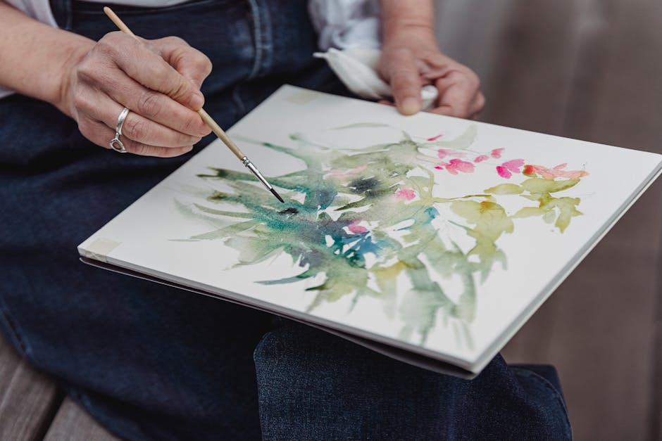
How Do You Mix Colors?
Mixing colors can be fun! Start with the basics: primary colors. These are red, blue, and yellow. You can make secondary colors by mixing them:
- Red + Blue = Purple
- Red + Yellow = Orange
- Blue + Yellow = Green
Once you understand primary and secondary colors, you can explore shades and tints:
- Shade: Add black to a color for a darker tone.
- Tint: Add white to a color for a lighter tone.
Experimentation is key! don’t be afraid to try mixing different colors to see what you can create. You might discover unique shades that enhance your artwork.
How Can You Use Color to Create Depth?
Color can also help create depth in your art. Bright colors tend to come forward, while darker colors recede. Heres how to use this to your advantage:
- Use warm colors in the foreground to grab attention.
- Apply cool colors in the background for a sense of space.
- Layer colors to create dimension and interest.
Try this technique in your next painting. Place a bright, warm flower in the front and a soft, cool landscape behind it. Youll notice how the flower pops against the background.
What Are Some Common Mistakes to Avoid?
Even seasoned artists can make mistakes with color. Here are a few things to watch out for:
- Overusing Bright Colors: Too many bright colors can overwhelm your viewers.
- Ignoring Color Harmony: Ensure your colors complement each other.
- Forgetting About Contrast: Use contrast to make important elements stand out.
By being mindful of these mistakes, you can create more visually pleasing art. Always step back and evaluate your color choices.
How Can You Learn More About Color?
If you’re eager to dive deeper into the world of color, here are some great resources:
- Creative Bloq’s Color Theory Guide – A comprehensive look at color theory.
- Skillshare Color Theory Classes – Hands-on classes to improve your color skills.
Consider joining online art communities or local classes. Engaging with fellow artists can inspire new ideas and techniques.
What Are Some Actionable Takeaways?
Ready to bring your art to life with color? Here are some steps to get you started:
- Identify the mood you want to express.
- Explore different color schemes and choose one that fits.
- Experiment with mixing colors to find unique shades.
- Practice using color for depth and contrast.
- Seek feedback from fellow artists and refine your work.
Remember, color is a journey. The more you practice, the better youll get. don’t be afraid to experiment and let your creativity shine!
By understanding and applying the principles of color, you can elevate your art to new heights. So grab your paints, choose your colors, and get started on your creative adventure!